Building a Better Community
Inventing a Non-Profit Brand That Transcends Change: Donated Branding Services for the Local Carlsbad Softball Association


Inventing a Non-Profit Brand That Transcends Change: Donated Branding Services for the Local Carlsbad Softball Association

“Southern California is BIG into softball. And I mean BIG. We’ve always had an amazing tight-knit community in the Carlsbad Softball world, and with amazing players and families what more do you need to really stand apart? Our mission has always been to create a positive and healthy atmosphere for everyone involved in the CSA and we’ve been successful in staying true to that throughout the years.
It wasn’t until Maddie Hays joined the league, and we met her marketing guru mom, that we realized the CSA did need something more to stand out in the ever-competitive SoCal softball world. (We call this the Hays Effect; you don’t know what you’re missing until you meet Susie Hays) Susie offered to rebrand the CSA for FREE and we’ve never looked back!
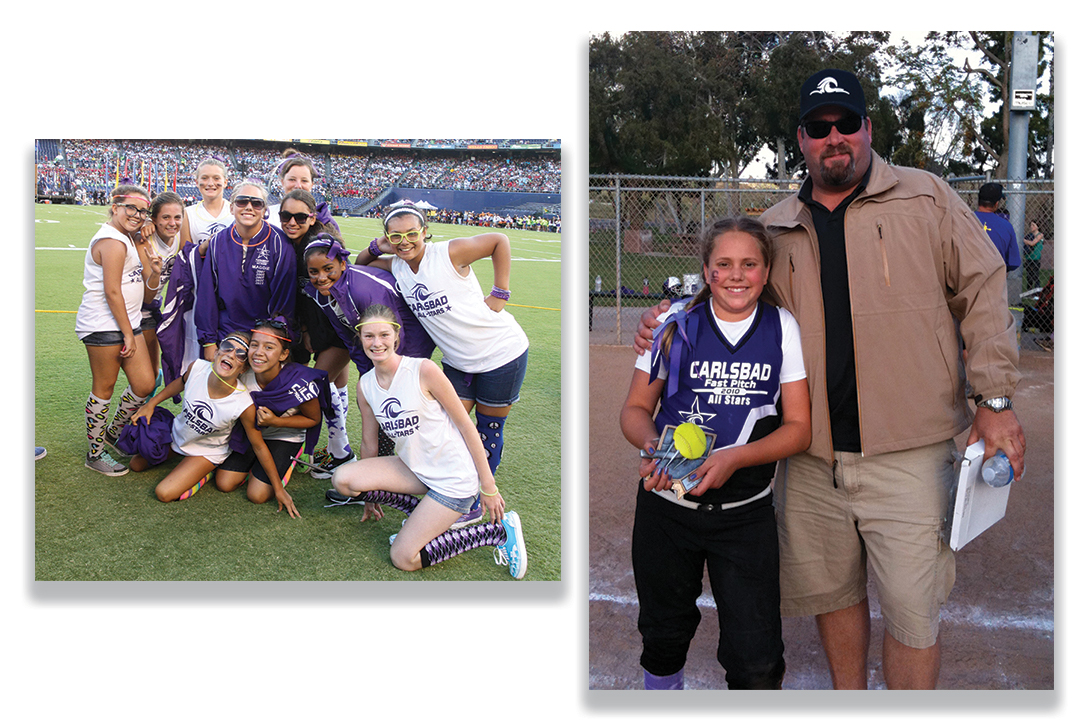
Susie’s cool multi-faceted logo represents the unique coastal community, the core values of our association and above all the players and their families. Oh did we mention the boost in spirit wear sales?
Even though Maddie has moved on and players have come and gone, our brand remains true in inspiring our Carlsbad Softball Youth.”
Ray Dresser
President
CSA
Carlsbad Softball Association (CSA) is a non-profit organization operated completely by volunteers and is registered with the Amateur Softball Association (ASA), the preeminent softball organization in America, as a Class “B” league in District 31 of Southern California Region 14. CSA was founded in 1967 to provide an opportunity for girls ages 5 through 18 to play fastpitch softball in Carlsbad, California. CSA funds itself entirely from registration fees, community sponsorships, snack-bar sales and events. http://www.carlsbadsoftball.org
At its core, the CSA was created to provide a positive and healthy atmosphere for young softball athletes with a focus on making them better. Over the years, the organization has found continuing success with this mission. They also have been consistent with their culture, spreading their voice through their online presence, on Facebook and their website, but also in person at events and providing branded merchandise to families, friends and fans.
However, the association has been a branding yo-yo, never having a consistent logo or brand to back the players, parents, coaches or teams. The CSA needed a design to solidify and reflect their core values, yet versatile enough to transfer all throughout the CSA products, events, and culture year after year.
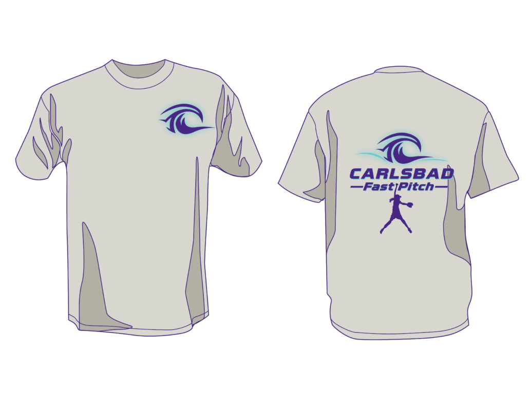
I was introduced to the organization when my daughter started playing for one of the teams, and immediately fell in love with CSA’s values and community. As the non-profit is run completely by volunteers, I jumped at the chance to offer my creative and consulting services to deliver a new brand for CSA.
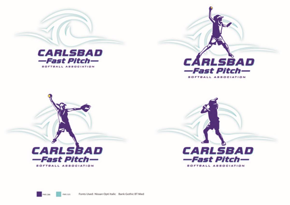
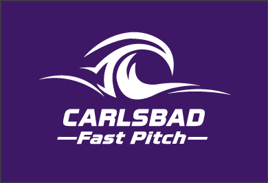
I envisioned this new logo symbolizing Carlsbad and the unique coastal environment, the girls, and softball as they all directly related back to CSA values. Graphically, I used a “C” as the primary icon representing the city, Carlsbad, and incorporated a wave element symbolizing the great coastal environment.
The final “C” wave design also incorporated a new proposed blue color and together the elements worked perfectly to encompass a cool, fun and competitive look.

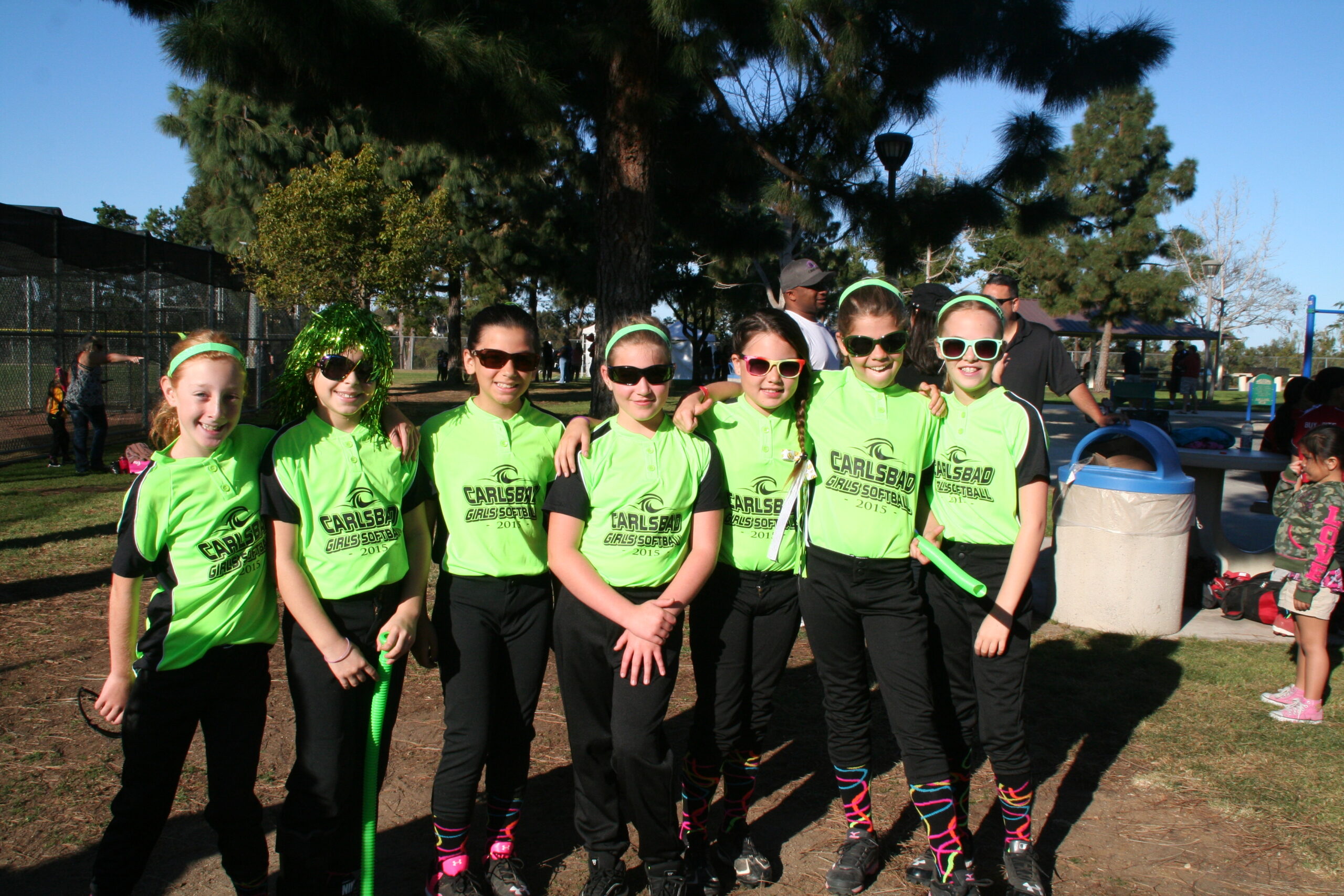
When developing a good and effective brand, it is important to consider how the logo will be used to make sure it has legs. While working on a main logo for the association I developed secondary logos for the sub-brands, specific programs and events. I also provided consulting services to implement the transfer throughout all CSA products, promotions, communications, social media and through streamlined website refinements.
The unveiling of the new brand was a hit. CSA is now positioned and represented in the community with a design that gets behind the players, parents and families and also showcases all the core values the organization brings to the plate.
CSA leaders change each year, new players and families join each season and the older players move onto travel ball, but this logo has remained strong and continues to evolve as a fun, fresh, energetic design.
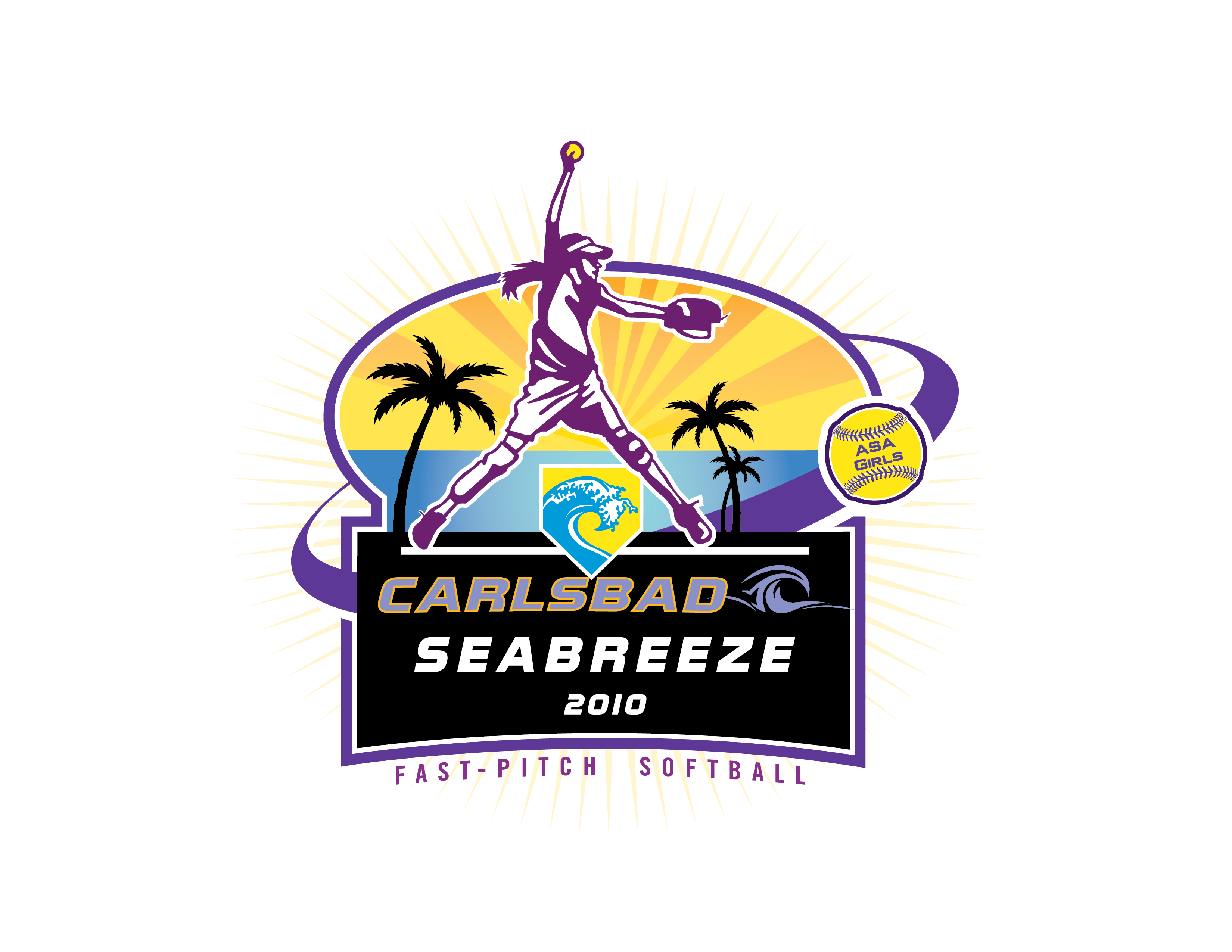
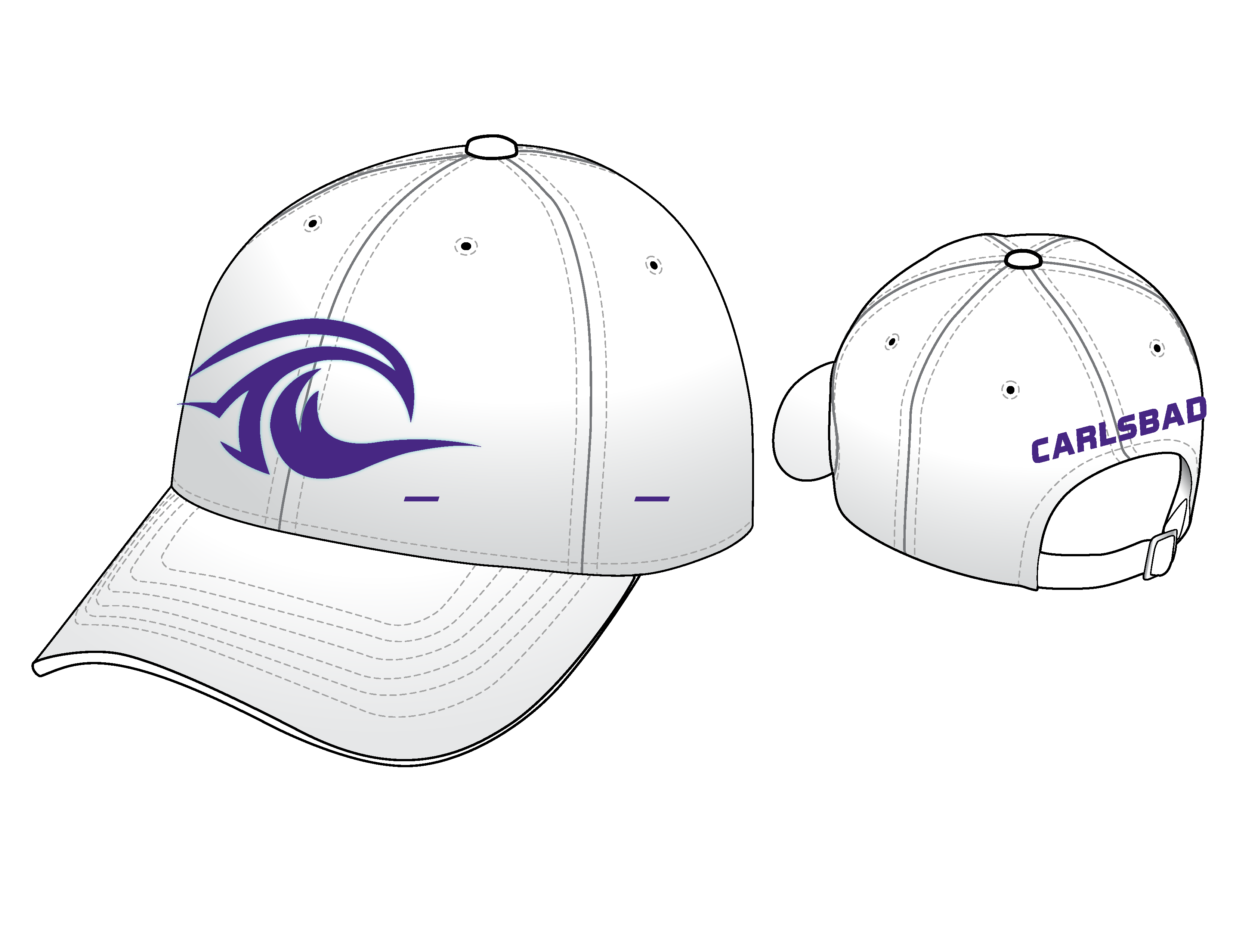
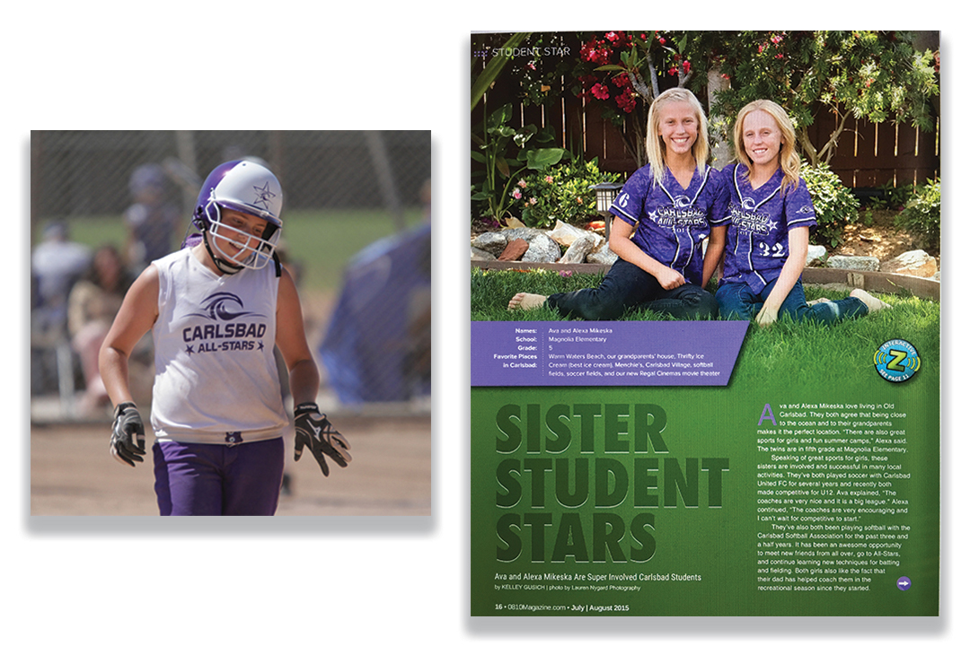
As the new brand rolled out and continues to be worn proudly on CSA spirit wear season after season, the association reports a continued boost in overall sales of spirit wear, a huge chunk of their overall funding.
Creating a lasting brand for the softball association has set the organization apart from other local teams with just the right image to inspire the youth, express a high level of competition and cement their offering of a well-supported environment for the girls.
CSA and their teams have garnered even more support from the city and local businesses with their fresh look, keeping the team on top of mind and helping to motivate registration each season.
760.459.9201
Susie@Q2Mark.com
Click Here Complimentary / Free 30 Minute Consultation Offer >>.
Let’s Talk About Your Business.